in and easy and accessible way.
(✨Codepen example at the end✨)

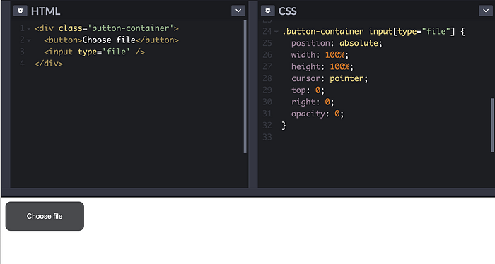
Let’s make a simple button, add input type=’file’ under it and place these two in a cosy container:
<div class='button-container'>
  <button>Choose file</button>
  <input type='file' />
</div>
Button styling. Here we have to make our button transparent if we want to add a hover state (later).
Focus state has to be added here (button is a clickable element and by default your browser will add an outline for keyboard users. Here we make focus style consistent with our hover style that we’ll add later).
button {
  border: 0;
  padding: 20px 40px;
  background-color: transparent;
  border-radius: 10px;
  color: #fff;
}button:focus {
  background-color: #000;
}
Button container will have the button colour that we want, and a hover state will be visible because we made our button transparent.
.button-container {
  position: relative;
  display: inline-block;
  background-color: #494a4d;
  border-radius: 10px;
}.button-container:hover {
  background-color: #000;
}
Key take-away here is to use display: inline-block. More about it here .
It’s a bit of CSS that often gets missed, but here it is exactly what we need. If we used display: block here, it would take up the whole block. Inline block respects the width and height of our button element here.
Then we make the input invisible by setting opacity: 0. If you want to see it, try setting opacity to i.e., 0.3
.button-container input[type="file"] {
  position: absolute;
  width: 100%;
  height: 100%;
  cursor: pointer;
  top: 0;
  right: 0;
  opacity: 0;
}
We absolutely positioned the input inside our button-container and took it’s whole width and height (which means the whole button is now clickable).
Click here to see it on Codepen.
happy coding 👩🏽💻

